
Tags

I’ve wanted to paint our master bedroom since the first of the year. Selecting a wall color is always a challenge for me and I lean on my friends for votes when it comes to the finalists once the samples are in place on the wall. I’m really skilled when it comes to second guessing my own decisions. So after discussing dark paint vs. light with nearly everyone, I decided to go with a darker paint and that resulted in narrowing it down to 3 colors that I really liked, but which one would win the beauty contest? After discussion and a visual assessment, my friend Carla voted for the color I thought I liked best. Confirmation with Mr. B and we now have Benjamin Moore’s Alexandria Beige on our walls, and most importantly, we love it.
Before…the room was painted a Martha Stewart/Green Tea color…you can see the botanic pics above the headboard. They were a little tired and faded.

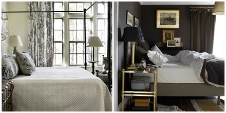
{Atlanta Home [left] ~ House Beautiful [right]}
After deciding on a paint color for the walls I felt it was important to think about replacing the botanic prints that had been hanging above the bed for the past 20 years.
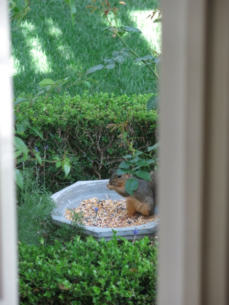
Sidebar: I bought Mr. B a bird feeder for Father’s Day. I know that sounds like it might be an odd choice but we love watching their antics, they’ve been very entertaining. Since birds have become such a delightful pastime for us, I decided to search for some antique bird prints for the existing frames. Not like we spend hours watching them but it is fun to go to the kitchen sink for a glass of water and see them carrying on.


…and Squirrel Nutkin visits regularly…
Back to replacing the botanic prints above the bed {focus, Karen}…I lucked out, an online store I had purchased my guest bathroom botanic plates from sent me an email indicating they were having a sale and I was able to buy 4 Dresser, hand colored plates of beautiful birds of Europe. Trillium Antique Prints offers a wide variety of antique plates from historic books. In the case of my birds, when I received the bird prints, they had included the description pages from the book that they were taken from.

Here’s the room with the new paint color and the bird-plates. I’m still working on finding pillow shams and a quilt to use at the base of the bed. The blue and white came from storage. We had purchased the Pottery Barn shams and quilt when he was working in Northern California. The jury is out on whether this is the best look for the room.
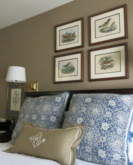

I apologize for the darkness of the photograph. It’s not the brightest of rooms in the house and my new white shades seem to throw a bit of glare in the picture. You get the jest of it though, right?

The bergere chair is covered in a bee fabric, I hope to find a pillow for that chair.

The lamp shades for our swing arm lamps are from Target. They are part of the Threshold line and very affordable. The shade is a white linen-look and I really like them.
Thanks for stopping by. The room is a work in progress, but then isn’t that the way with a home?
We leave for Austin tomorrow morning to babysit Olivia! I’ll be back in time for a post next week. Enjoy the rest of your week and have a wonderful fall weekend. ♥ Karen

julie ~ eab designs said:
Hi Karen, The timing of your post is perfect for me. Our house is filled with botanicals and I was just thinking of updating the 8 in our family room with something new. Love your new bird prints. Also, we have the identical botanicals that are above your nightstands. Ours hang in the kitchen and I still love them.
Karen B. said:
Julie, I originally thought about eliminating all of the botanics in our bedroom but like you, the two that you and I both enjoy are still favorites. Besides the nightstands looked a little lost without them. xo, Karen
Victoria • Restoring our Victorian said:
I really hate choosing paint. I mean, I am really good at the part where you go and get 10,000 little sample cards… But the part where you actually have to choose just one? Not so much.
I love the color you ended up with. It looks like a very rich linen.
p.s.- my mom has pretty much that exact chair. But her bee fabric is red and gold.
Karen B. said:
Victoria, Paint is so dang difficult, even when you paint a large sample. Our family room matches the paint sample exactly and still looks different to me! I knew I’d like your mom! 😀 xo
Victoria • Restoring our Victorian said:
I hit enter too soon! Meant to say have fun with Olivia! Enjoy your trip…
Karen B. said:
Thanks, need me to send you some BBQ?
for the love of a house said:
The new bedroom is wonderful Karen! Love the bedding and the wall color and the new (antique) bird plates. We used to collect John Gould’s handcolored antique lithographs, so I love birds too. Beautiful job on the room!
Karen B. said:
Thanks, Joan. The bird prints are so much fun, especially since we have the description pages from the original book. xo, Karen
around the table said:
Hi Karen,
Your bird plates look perfect and I love the new wall color! We enjoy our birds too and have had MANY bird feeders like yours ~ that have been destroyed by our local black bear 😦 My husband is so funny because he keeps moving them higher up the tree in hopes of “winning” the battle with the bears;) Enjoy your day! xxleslie
Karen B. said:
Leslie, This bird thing cracks me up. I love nature but my husband has adopted this as his new hobby! 😀 We don’t have bears but we do have a red tailed hawk that has swooped in and grabbed a mourning dove. That’s when I don’t enjoy nature as much…can’t everyone just get along? xo, Karen
Linda Coble said:
Karen,
The pics of your “new” bedroom are wonderful. I love the paint color you chose — it really sets off those antique bird prints. I always have trouble selecting paint colors and need to get friends to weigh in on the decision. Obviously, you got some good advice because the color looks fantastic.
The bird feeders are great too. I loved the one you got for Lyn’s Father’s Day gift. I don’t have any feeders currently. However, the blue jays have discovered our cat, Stymie’s, outdoor food dish on the balcony. They make daily visits and really put up a fuss if the food dish is empty. Greedy little buggers!
Karen B. said:
Thanks, Linda. It felt good to spruce things up a bit in there. xo, Karen
msshe said:
I like your new color!
she… Sent from my iPad
>
Karen B. said:
Thanks. Happy fall. Karen
Alison said:
Hi Karen!
What a gorgeous shade of paint! Alexandra Beige. I must remember THAT one.
It looks gorgeous with your bedding choices and your bird prints. SO pretty!!
GUESS WHAT????
You are one of the TEN WINNERS for the magazine giveaway!
Stop by the blog for more info. I just need your address so I can
mail it out!
Thanks for entering and CONGRATS!
xoxox
Alison 🙂
Karen B. said:
Oh, Alison! I’m so excited. I’ll head over now, but here’s my address…Karen Bunch, 31 Bethany Drive, Irvine, CA 92603
I really wanted a copy and was trying to figure out if I could find one when we visit Texas this week. xo, Karen
Loi Thai - Tone on Tone said:
Hi, Karen – Such a rich, beautiful paint color! And I love your bird prints. I’m glad you chose 4 because together they make such an impact. Have a wonderful and safe trip. Enjoy your time with Olivia 🙂
xo
Loi
Karen B. said:
Thanks, Loi. I appreciate a compliment from you, your style is exceptional! xo, Karen
taylor Greenwalt said:
I love botanical s and bird prints…sometimes you just have to up-date the mats..I just framed 6 botanicals for my home…
Karen B. said:
Julie, I have a confession, that I couldn’t quite bring myself to post…the botanical prints were from a Laura Ashley calendar. Ha. It was back when we first moved into this house and the budget was tight…we kept them and I liked them much longer than I thought I would. I was tired of them, but the 2 over the nightstands have a little better provenance and I still like them. I agree, matting can bring life to an older print. Framing in general makes all the difference, doesn’t it? xo, Karen
D'Arcy H said:
Karen, I just love this color! And I think the blue and white shams and quilt are wonderful with it–I like blues and browns together, and the blue picks up some pale blue in your new bird prints (at least I think I see some in the backgrounds?). We toured an estate this spring that had a dark taupe bedroom, and while I usually go for lighter colors, we were struck by how gorgeous it was. Nice job!!
Karen B. said:
Thanks, D’Arcy. It’s nice to have everyone be complimentary…I think Mr. B. was a little concerned but even he likes the darker color…phew. xo, Karen
Phyllis said:
Karen, what a fabulous update. I love the paint color you chose, it is very elegant, particularly combined with the prints, and the blue and taupe pillows work so well together. On the whole I would say it is very chic!
All best,
Phyllis
Karen B. said:
Thanks, Phyllis. I needed a little change. xo, Karen
Gretchen said:
Karen, I agree with all your other followers that the new bedroom looks great and the paint color is perfect! It really sets off the delicate bird prints. I think the blue and white bedding is a great choice too. You’ve totally transformed your room!
Karen B. said:
Thanks, Gretchen.
It’s nice to have a change now and then. 😀 xo, Karen
Kelly - Talk of the House said:
Well, I am late to the post, but I just wanted to say how much I like the new paint color. It is very similar to what we have around here. You will find that it works well with many colors, and I really like it with the beautiful blue bedding. And your bird prints are not only pretty, they are also meaningful with your interest in the birds that grace your yard.
Yes, everything seems to be a work in progress. Hope your trip was a good one.
Karen B. said:
Thanks, Kelly. I do love the color and was inspired a bit by your home. I enjoy the red, blue, khaki and black accents that you share with the seasons. Our trip was so much fun…being grandparents is the best! xo, Karen