• About GH&P
  • Contact Us

Garden, Home & Party

~ My love of gardening, making home comfortable and entertaining friends and family.

Garden, Home & Party

Category Archives: Paint Color

Matching paint – trim and walls

21 Wednesday Sep 2016

Posted by Karen B. in Paint Color

≈ 22 Comments

Hi there!  Happy Wednesday.

There is a relatively recent trend to paint walls and trim the same color.  I’ve seen some rooms done this way that are very appealing.  I confess, I’m old school and appreciate a distinction, no matter how subtle, between the two.

Garden, Home and Party: Paint

{via}

Houzz gave the trend press in early 2013, with a quote from architect Treff LaFleche who states  that matching trim and walls “emphasize the functional purpose of architectural trim and creates a more understated and contemporary composition.” I agree, but my traditional leanings probably balk at the “contemporary” reference.

Garden, Home and Party: paint

{via}

There is something modern and soothing about trim painted the exact same color as the walls. It creates a seamless look and works well if you plan to leave your walls bare or cover them with a thousand pieces of art.  -Houzz

Garden, Home and Party: paint

{via}

Garden, Home and Party: paint

{via}

Garden, Home and Party: paint

{via}

Garden, Home and Party: paint

{source unknown}

This butler’s pantry is striking—slate walls, cupboard fronts and trim.

Garden, Home and Party: trim and paint

{via}

The wood beadboard, crown moulding, window trim, and casing, match but the toile breaks up what could be too much of any one color.  A lively example of contrast between wall and trim.

Garden, Home and Party: paint

{source unknown}

All white kitchens are always beautiful to me.  Maybe the variance found in the counter, the stainless steel appliances, and the tile backsplash over the range give it the added pop of contrast.

Garden, Home and Party: paint

{via}

Garden, Home and Party: paint

{via}

Garden, Home and Party: paint

{via}

What do you think?  Would you paint the trim and walls the same color?

♥ Karen


A touch of red

10 Wednesday Feb 2016

Posted by Karen B. in Accessories; details, Paint Color, Valentine's Day

≈ 31 Comments

Tags

Valentine's Day

Garden, Home and Party: Valentines day red

             ♥  ♥  ♥

Good morning!  Since Valentine’s Day is a short 4 days away, and I’m sure you’ve all bought your valentines and planned your special meal weeks ago, I thought I’d share a few rooms that highlight a touch of red, a traditional Valentine’s Day color.  For some of us red is welcome year round, embraced even.

But I understand that not all share my enthusiasm for the color. Still, here are some lovely rooms with a touch of red that even you might like. 🙂

            ♥  ♥  ♥


                                      {via}

Red doesn’t have to fill the room to be noticed, as my friend, the talented Loi of Tone on Tone demonstrates here.  That red apple not only looks good enough to eat, but makes the perfect trilogy of lovely for this vignette.

Garden, Home and Party: valentines red

{via}

The red in this mostly white bathroom adds a welcome brightness, subtle enough to add a needed pop of color. There is a framed picture of the Cat in the Hat to the right of the mirror, this may be a child’s bathroom.  It’s very cheery.

Garden, Home and Party: valentine red

{via}

Love this pretty distressed chest in red.  This could be a showstopper in any home.

Garden, Home and Party: valentine's red

{via}

I really like this hutch that has been painted a contrasting color inside.  I like the way it brings notice to the items stored inside.

Garden, Home and Party: valentine's red

{via}

…then there’s this.  I love this library by Gil Shafer III and somehow the red seems just right!

Garden, Home and Party: valentine's red

{via}

James Farmer and this room is an all-time favorite.  Yes, I know it’s dressed for Christmas and yes, I know you’ve seen it dozens of times, but it’s so pretty…you don’t mind, do you? 🙂

Garden, Home and Party: valentines red

{via}

The red lamps add such a wonderful touch to this outdoor table.

Garden, Home and Party: valentine's red

{James Farmer ~ photographed by Emily Elkins Photographer}

There is a regal look to red in a formal room.  Isn’t this a pretty sconce on the red wall, with a stenciled door (?) to the left?

Garden, Home and Party: valentine's red

{via}

Layla’s [The Lettered Cottage] reading nook in their first house is so inviting and the smallest touch of red makes the space seem finished.

Garden, Home and Party: valentine's red

{via}

Finally, a favorite use of the color!  Oh to be in London!

Garden, Home and Party: valentine's red

Have a special Valentine’s Day. Celebrate the day with those you love. 

Karen ♥

Since we’re on the subject of LOVE, I just wanted to pass along a good word on a soon to be released book.  My friend, Kristy Woodson Harvey {Design Chic and Kristy Woodson Harvey} has a new book to be released in April.  LIES AND OTHER ACTS OF LOVE.  The is as entertaining as her first book, Dear Carolina.  I’m honored to be previewing the book and will post my review in April. You can preorder here.

Garden, Home and Party


Dark doors and windows

04 Wednesday Mar 2015

Posted by Karen B. in Paint Color, Trends

≈ 30 Comments

Tags

dark windows and doors

I want to take a moment to thank those of you sent such kind words of support regarding Mr. B.  I shared the comments with Mr. B. and he said I must have very nice blog friends! {I do!}

I can’t be certain of when I first saw a blog post on painting interior doors and/or window panes black (or charcoal), but I was immediately smitten with the look, the contrast seems to enliven a room.  I really love the look and have toyed with the idea [on paper and in my mind] for years, maybe next house(?)

Garden, Home and Party: dark doors and windows

{via – above/below}

Garden, Home and Party: dark doors and windows

I’m still not ready to pull the trigger, so to speak, but it gives a room an unexpected “wow” factor.

These bathroom doors appear to be vintage.  I would definitely go for the dark trim if I had a similar pair.

Garden, Home and Party: dark doors and windows

Melaine, of My Sweet Savannah, recently addressed this topic and it gave me pause. Here’s what she had to say,

“A few years ago I painted 90% of our interior doors black.  I love them. They do require more upkeep as they show more dust and when you have pets they show every little mark.”

Garden, Home and Party: dark doors and windows

You see, like Melaine, I have pets and lots of dust.  Mr. B. believes the dust is due in part to the fact that we have the doors and windows open 3/4 of the year due to the warmer weather we experience here in sunny Southern California.  Add the fact that the dogs pretty much have free reign of the house—they are in and out a lot.  So maybe it’s like owning a black car.  Pretty, but high(er) maintenance.

Garden, Home and Party: dark doors and windows

Still, I love the look and will continue to give it serious consideration.  What do you think?

Darden, Home and Party: dark doors and windows

Don’t you love this shower?  Dark panes mirror the dark grout on the subway tile and the added drama of the black and white tile floor of the shower is a design win in my book.Garden, Homo and Party: dark doors and windowsThe foyer (below) manages the dark doors with grace; the extra black in the bannister and furniture makes me happy. 🙂

Garden, Home and Party: dark doors and windows

I like this pair of doors.  I think the reason this works so well is the trim remains fresh in shades of white, while the doors stand out.  

Garden, Home and Party;: dark doors and windows.

Garden, Home and Party: dark doors and windows

The use of black on these french doors is surprisingly understated in this neutral room.  Chairs in black are so pretty.

Garden, Home and Party: dark doors and windows

Black enamel dutch doors, so pretty. {our front door is a dutch door, this is very tempting.

Garden, Home and Party: dark doors and windows

{via – above and below}

Garden, Home and Party: dark doors and windows

Garden, Home and Party: dark doors and windows

Garden, Home and Party: dark doors and windows

Have you been tempted?  I love the color of this door with it’s brass hardware.

Have a great Wednesday!

♥ Karen


{Garden} Backyard birding and decor decisions

23 Wednesday Oct 2013

Posted by Karen B. in Decorating, House and Home, Paint Color, Renovating

≈ 28 Comments

Tags

Master Bedroom

Backyard birding, renovating our bedroom

{via}

I’ve wanted to paint our master bedroom since the first of the year. Selecting a wall color is always a challenge for me and I lean on my friends for votes when it comes to the finalists once the samples are in place on the wall.  I’m really skilled when it comes to second guessing my own decisions.  So after discussing dark paint vs. light with nearly everyone, I decided to go with a darker paint and that resulted in narrowing it down to 3 colors that I really liked, but which one would win the beauty contest?  After discussion and a visual assessment, my friend Carla voted for the color I thought I liked best.  Confirmation with Mr. B and we now have Benjamin Moore’s Alexandria Beige on our walls, and most importantly, we love it.

Before…the room was painted a Martha Stewart/Green Tea color…you can see the botanic pics above the headboard.  They were a little tired and faded.

before picture, master bedroom

Inspiration…

master bedroom inspiration

{Atlanta Home [left] ~ House Beautiful [right]}

After deciding on a paint color for the walls I felt it was important to think about replacing the botanic prints that had been hanging above the bed for the past 20 years.

Sidebar:  I bought Mr. B a bird feeder for Father’s Day.  I know that sounds like it might be an odd choice but we love watching their antics, they’ve been very entertaining.  Since birds have become such a delightful pastime for us, I decided to search for some antique bird prints for the existing frames.  Not like we spend hours watching them but it is fun to go to the kitchen sink for a glass of water and see them carrying on.

backyard birding-Garden, Home and Party

backyard birding, Garden, Home and Party

backyard birding, Garden, Home and Party

…and Squirrel Nutkin visits regularly…

backyard birding, squirrel

Back to replacing the botanic prints above the bed {focus, Karen}…I lucked out, an online store I had purchased my guest bathroom botanic plates from sent me an email indicating they were having a sale and I was able to buy 4 Dresser, hand colored plates of beautiful birds of Europe.  Trillium Antique Prints offers a wide variety of antique plates from historic books.  In the case of my birds, when I received the bird prints, they had included the description pages from the book that they were taken from.

painting depicting woman with bird cage

{tumblr – Persephone’s Box}

Here’s the room with the new paint color and the bird-plates.  I’m still working on finding pillow shams and a quilt to use at the base of the bed.  The blue and white came from storage.  We had purchased the Pottery Barn shams and quilt when he was working in Northern California.  The jury is out on whether this is the best look for the room.

Garden, Home and Party: Birding and a new bedroom redo

Garden, Home and Party: New paint color and bird plates, MB

I apologize for the darkness of the photograph.  It’s not the brightest of rooms in the house and my new white shades seem to throw a bit of glare in the picture.  You get the jest of it though, right?

Garden, Home and Party: Birding and a New color for the bedroom

Garden, Home and Party: Master Bedroom, paint color

The bergere chair is covered in a bee fabric, I hope to find a pillow for that chair.

Garden, Home and Party: Birding and a new bedroom color

The lamp shades for our swing arm lamps are from Target.  They are part of the Threshold line and very affordable.  The shade is a white linen-look and I really like them.

Thanks for stopping by.  The room is a work in progress, but then isn’t that the way with a home?  

We leave for Austin tomorrow morning to babysit Olivia!  I’ll be back in time for a post next week.  Enjoy the rest of your week and have a wonderful fall weekend. ♥ Karen

{Home} Keeping things neutral

27 Wednesday Feb 2013

Posted by Karen B. in Decorating, House and Home, Paint Color, Trends

≈ 20 Comments

Tags

neutral color palate

1-snowy villageSince many are still experiencing winter at her snowy best (or worst) I thought I would stay indoors and ponder the beauty of a neutral color palate for a room…

This is Wikipedia’s definition of neutral color: 

Grey or gray is an intermediate color between black and white, a neutral or achromatic color, meaning literally a color “without color.” [2] It is the color of a cloud-covered sky, of ash and of lead.[3]

In Europe and America, grey is the color most frequently associated with the elderly, humility, reflection, boredom, dullness, uncertainty, and indifference.[4]

Pretty funny.  Grey isn’t the first or only color that pops into my head when I think of a room reflecting a neutral palate.  I usually think of white or a soft beige and maybe a little grey. And what’s up with the second paragraph…who entered this opinion?

I am attracted to neutral rooms, and yet I know I am not one to want to live in a home that is primarily decorated in shades of neutral.

Today, I’m sharing today, rooms that are primarily neutral.  I love each and every image I’m sharing but I’ve soul-searched and I can’t make the leap.  Maybe when I move to that cottage in the Cottswolds?

2-living room, linen heirloom...

3-paperwhites on din table Tricia Foley, The Table{queen of white ~ Tricia Foley}

4-house beautiful5-Nancy Fishelson, Litchfield, CT{Nancy Fishelson ~ Litchfield, CT}

6-el'lefebien via belgian pearls 2.10.13{El’lefebien via Belgian Pearls}

7-brabourne farm l r{Brabourne Farm}

4-AD_thumb{Architectural Digest}

9-jayne-090_thumb1{Cote de Texas}

10--four leaf4wwatermark{Segreto Finishes}

11-200480620883076519_g7ZcCICR_f12-home bunch, floor in spain{Home Bunch}

13-Southern Accents Photo Antoine bootz Designer Bobbi Smith[4]{Photo by Antoine Bootz ~ Southern Accents}

14abelgian pearls{Belgian Pearls}

14-david michael miller designer, providence 9.17.12{Providence Ltd. Design}

15-lantlivinorregrd-blogspotdotcom

The promise of spring is just around the corner.  I hope you are warm and dry and may spring shine on your home soon.

{Home} What is it about men and wood?

14 Tuesday Aug 2012

Posted by Karen B. in Decorating, House and Home, Paint Color, Renovating

≈ 11 Comments

Tags

painting

Sometime earlier this month I unveiled our newly painted family room.  We I decided I was tired of the rich, red walls and ready for a change to a slightly more neutral setting.

I asked my loyal readers, all 6 of them, 🙂 what their thoughts were on painting the ceiling white, like the fireplace, French doors and entertainment center, and each person was wholeheartedly in favor of the idea.

I casually mentioned this fact to Hubby and he acted as though I had asked him to run naked down the freeway.  This got me to thinking of the various blog sites that had shared similar stories where they were longing to paint their paneled, orangey pine walls white, and husbands far and wide responded anywhere from mild protestation to downright forbidding such appalling violation of the natural beauty and appeal of wood sans paint.

{source}

What is it about men and wood?!

{source}

I can appreciate natural wood as much as the next guy, or girl, but there are times when a room needs the lift of a little paint.  Besides, the ceiling in our family room is very inexpensive wood, tongue and grove so it’s not as if I’m asking Hubby to paint over burl wood or mahogany.

{source}

I do love natural wood in a cabin setting in the woods, like the beauty above.  In a horse stable (below), sign me up.  There is nothing like it.

Great, old wood floors are amazing.  I’ve seen some attractive painted wood floors but I don’t believe I would ever paint my hardwood floors.  See, I can be reasonable about wood.

If our ceiling was made from wood such as the two rooms below, I’d want it to be left natural, honest.

{Belgian Pearls}

{haus design}

This is more like it…see how clean and nice this ceiling looks, that’s the look I’m going for.

{Design Chic}

{Design Chic)

And finally…this room probably gives men everywhere the best of both worlds.  The ceiling is white but also has wonderful natural wood beams to off set the paint.  The fireplace over mantle appears to be recycled wood.

{Things That Inspire}

What do you think, there’s no right or wrong answer.  It’s what you love and feel comfortable with, right?

{GHP} I’ve got the blues

26 Thursday Jul 2012

Posted by Karen B. in Collections & Accessories, Decorating, House and Home, Paint Color

≈ 10 Comments

Tags

the color blue

As I’ve mentioned once or twice (or incessantly), I gravitate towards the color blue.  Not just in accessories for the home but in other formats as well, such as…

{tumblr}

and…

tumblr{tumblr}

and…

{tumblr}

So I have the summer blues and thought I’d share some of what I’ve found while visiting, and admiring some of the many talented bloggers out there…oh, and I was visiting blogs around the world in hopes of becoming inspired for a topic for a post of my own.  {Is it just me or has summer given you the felling you’d rather be reading on the porch, with a glass of something and not a care in the world than doing anything remotely tied to thinking?}

Back to the topic at hand.  I have embarked on the blue and white thing, all in moderation. {I know, I’m a little late to this party}  But it seems that I see all manner of wonderful blue and sometimes blue and white items of interest, along with some pretty great rooms.

I love the bold blue on this house (below) but I’m certain our Homeowner Association wouldn’t  allow it.  I also really like the detailing around the windows.

{tumblr)

The blue shutter caught my eye, but there isn’t much I don’t absolutely love about this house/hotel entrance(?)

{tumblr}

I like the overall neutral feel to this room, just the blue pillows to give it the touch of blue and white.

photo by Adam Butler

Such a clean (for now, see the doggies?) look, plenty of fresh white with hints of blue.  So pretty.

Better Homes and Gardens

I’m always drawn to blue and white plates in a grouping…

Ginger Barber Designs

~ or ~

in an antique store.

Scott Meacham Wood and more…

SMW

Its the subtle use of blue and most appeals to me.

Love French Bulldogs – tumblr

I love the ceiling in this image, as well as the Shaw farm sink.  The blue, white and hint of green in the curtains really make the room alive with interest, don’t you think?

Tiffany Eastman Design

Last but not least, signs and other random containers in blue and white can catch my attention…

Does blue and white figure into your home?  Do you have a favorite color?

{Home} Red to Taupe (gray)?

12 Thursday Jul 2012

Posted by Karen B. in Decorating, DIY (do it yourself), House and Home, Paint Color, Renovating

≈ 19 Comments

Tags

Family room redo

Well, I’ve done it.  I made the switch.  After nearly 15 years of living with red, really burgundy, walls in our family room and kitchen I called our painter and had the walls painted.  I’m not sure what triggered the need for change, is anyone ever really aware of these motivations, but it was time.

Painting the family room

I can speculate that we were charging into summer when, once again, the room would feel a little warm, even though we rarely use our air conditioning due to the pleasure of mother nature’s natural air conditioning…a wonderful fog bank that creeps over the hills most evenings and cools us down, thank you Newport Beach, the red color gave off a psychological warmth (if there is such a thing).  Great in the cooler months, not so much in summer.

I had written a post about my leaning towards a more neutral color palate for that space and I must say, even though it’s taken a few days to pull the room together, I’m happy with the change.  And, maybe more importantly, Hubby likes it.  He rarely has input in these matters, and is just as happy to go along with my incessant pondering of new design ideas for our home, but he likes the less cluttered look I’m striving for so all is well.

One of my motivations for the change can probably be attributed to these porcelain jars…Tina over at The Enchanted Home opened a store and sells some wonderful items.  I found these (image below) and fell in blue and white porcelain love.

Somewhere down the line I will most probably reupholster the sofa in more of a neutral, non-patterned fabric but that will have to wait for now.

As with all home decor changes a proverbial can of worms is opened.  We knew the over mantle needed a fresh coat of paint.  So, we painted it.  Now the brick surround needs paint but that is adjacent to the French door, which is painted the same color as the brick and the same color as the entertainment center, which was a bigger project than we were ready to tackle this weekend.  So, painting those items will be on the list for later.  I also have questions about the ceiling, which is tongue in grove wood, stained lightly with white.  It looks like a limed pine but we’re now wondering if somewhere down the line we need to paint it white.

Any ideas?  Would the white paint we’ve used on the over mantle be too much white?

Meanwhile, I am content with the changes.  I can be patient for the final paint work that will need to take place, {hopefully}.

Happy Tuesday, my friends, hope your week is a happy one.

{Home} Neutral ground

12 Tuesday Jun 2012

Posted by Karen B. in Decorating, Paint Color, Renovating, Trends

≈ 9 Comments

Tags

neutral color palate, paint color

I’ve always enjoyed color.  I admit, when we moved into our smallish home 30 years ago {I was but a child :-)} a designer friend of mine gave me some very good advice.  She recommended that I choose a color palate and use it as a guide with each room.  A small house, she explained, will feel more spacious if there’s some uniformity within the overall décor.  {Thank you, Gretchen} I would say it has worked well for us.  I’ve always kept the baseboards, door casings, raise paneled doors, paned windows and French doors painted the same white throughout the house (Antique White to begin with, Porcelain now).

Karen B. Family Room1

Karen B. red check sofa
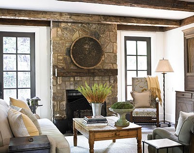
Maybe the sofa IS looking a little tired, it’s not that old but it does see a lot of wear.

Karen B. French doors, Royal Dalton plates

Overall I had a cohesive color scheme that originated with hunter green as the bold color for carpet and even the walls of the family room.  Later, as we added oak wood flooring throughout, the carpet was changed to a neutral and kept only in the bedrooms.  Years passed and I needed a change.  I switched the color combination to red, khaki and black, and boldly painted our family room and kitchen Benjamin Moore, Classic Burgundy.  That was probably over 15 years ago.  I bet you can see where this is heading.

Karen B. Family room2

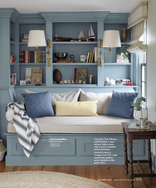
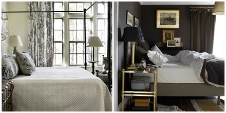
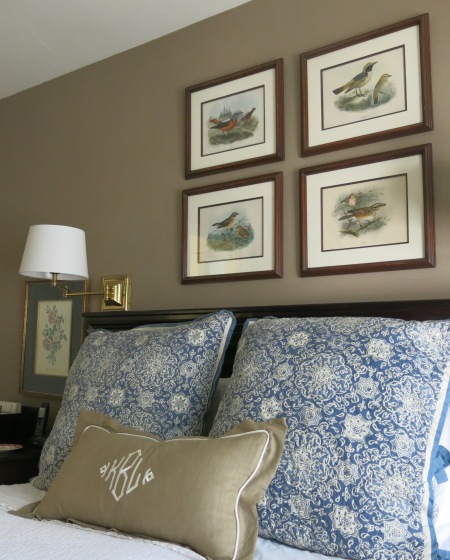
I’ve recently been attracted to neutral rooms.  I don’t want to go overboard with a neutral palate, and with budget constraints and upholstered furniture that isn’t overly worn or in need of re-upholstery work, will remain as it is right now.  But somewhere down the line I think I’d like the family room and kitchen walls painted a taupe/gray.  I would also love to introduce a bit more blue and white.  As you can tell from the photographs, I’ve got a few items but I could see blue and white ginger jars on the mantle, maybe a neutral sofa at some far-off date, with some blue and white tapestry or other fabric pillows.

Tina’s shop at The Enchanted Home had these lovelies:

…and the most recent online issue of Lonny Magazine featured Christy Ford’s home, the author of …and George blog…isn’t this lovely…

Lonny Magazine

There’s been no end to the inspiring neutral rooms and as I said, I believe I’ll always want color but I would like a change, and with it, maybe some calm in my surroundings.  Early inspiration came from fellow blogger Joan, for the love of a house.  I found the room’s of her restored farm house to be what my mind’s eye had envisioned…

for the love of a house

for the love of a house

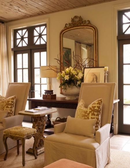
John Saladino creates an understated beauty with his simple and neutral rooms.

This next room (I believe I found the image on Cote de Texas) features burlap curtains, but it’s the casual comfort and neutral color palate  the room displays that draws my attention.

I fell in love with Michael Bastian’s apartment when adventures in tartanscot shared some of the space with his readers.

This room from a post at The Enchanted Home has neutral and blue and white touches {sigh}

The Enchanted Home

I would love beams in our home, I have one that was created when we remodeled but check this dining room found at Ivy Clad…so pretty AND neutral.

Ivy Clad

Any Pam Pierce room is beautiful, this one is especially remarkable.

Mary Ann at Classic Casual Home lives in California, as do I, and I’ve noticed she shares some beautiful rooms, many of them have this neutral look I’m talking about, like…

And this final image I can’t recall where it’s from, but it sure is pretty.

{via Maison Decor}

I will always lean towards some amount of color within the room’s decor, but I might be ready for a more neutral palate.

All input and opinions are welcome.  Share your thoughts with me, I love our chats!

xo, Karen

I’ve attached the link to the image above, {thanks to my blog friend, Kifus, at Inspiring Interiors)

I’m visiting Savvy Southern Style at her Wow us Wednesday, join the fun.

Recent Posts: Garden, Home & Party

Homes that welcome the season

A little this and that

The color of autumn

Wall Art Inspiration for our bungalow

Project Design: Outdoor Living Spaces

Enter your email address to subscribe to GH&P and receive notifications of new posts by email.

Instagram


Follow gardenhomeparty on Twitter

Follow on Tumblr

Google Plus

Recent Posts

  • Homes that welcome the season
  • A little this and that
  • The color of autumn
  • Wall Art Inspiration for our bungalow
  • Project Design: Outdoor Living Spaces

Categories

  • Accessories; details
  • Annual WP Report Card
  • Antiques
  • Architects & Builders
  • Architectural elements
  • Autumn
  • Bastille Day
  • Bathroom
  • Bedrooms
  • Christmas
  • Collections & Accessories
  • Cottages
  • Decorating
  • Designer
  • Dessert
  • Dining Room
  • DIY (do it yourself)
  • Drink
  • Easter
  • Entertaining
  • Fall Entertaining and Decorations
  • Family
  • Flowers
  • Food
  • Gardening
  • Gardens
  • Halloween
  • Holiday/Seasonal cooking
  • Holidays
  • House and Home
  • Independence Day
  • Kitchen
  • Maintenance
  • Misc
  • Outdoor living
  • Paint Color
  • Party Planning
  • Personal Information
  • Recipes
  • Renovating
  • Seasons
  • Simple Meals for the Avid Cook
  • Spring
  • St. Patrick's Day
  • Storage/Closets/Pantry
  • Study/Office
  • Summer
  • Thanksgiving
  • Traditions
  • Travel
  • Trends
  • Uncategorized
  • Valentine's Day

Recommended

  • Bastion & Lark
  • Content in a Cottage
  • Cote de Texas
  • French Essence
  • French Kissed
  • Garden, Home and Party
  • Greige Design
  • Heirloom Philosophy
  • Henhurst Interiors
  • In the Fields
  • Jennings & Gates
  • Making Magique
  • Miss Mustard Seed
  • paper{whites}
  • Polished Pebble
  • Providence Ltd Design
  • Restoring our 1890 Victorian
  • Slim Paley
  • Splendid Willow
  • Talk of the House
  • TG Interiors
  • The Adventures of Tartanscot
  • The Enchanted Home
  • The House of Edward
  • The Lady's Life
  • The Pioneer Woman
  • The Polohouse
  • Tone on Tone
  • Trouvais
  • Velvet & Linen

Archives

  • October 2019
  • September 2019
  • August 2019
  • July 2019
  • May 2019
  • April 2019
  • November 2016
  • October 2016
  • September 2016
  • August 2016
  • July 2016
  • June 2016
  • May 2016
  • April 2016
  • March 2016
  • February 2016
  • January 2016
  • December 2015
  • November 2015
  • October 2015
  • September 2015
  • August 2015
  • July 2015
  • May 2015
  • April 2015
  • March 2015
  • February 2015
  • January 2015
  • December 2014
  • November 2014
  • October 2014
  • September 2014
  • August 2014
  • July 2014
  • June 2014
  • May 2014
  • April 2014
  • March 2014
  • February 2014
  • January 2014
  • December 2013
  • November 2013
  • October 2013
  • September 2013
  • August 2013
  • July 2013
  • June 2013
  • May 2013
  • April 2013
  • March 2013
  • February 2013
  • January 2013
  • December 2012
  • November 2012
  • October 2012
  • September 2012
  • August 2012
  • July 2012
  • June 2012
  • May 2012
  • April 2012
  • March 2012
  • February 2012
  • January 2012
  • December 2011
  • November 2011
  • October 2011
  • September 2011
  • August 2011
  • July 2011
  • June 2011
  • May 2011
  • April 2011
  • March 2011
  • February 2011
  • January 2011
  • December 2010
  • November 2010
  • October 2010
  • September 2010
  • August 2010
  • July 2010
  • June 2010
  • May 2010
  • April 2010
  • March 2010
  • February 2010
  • January 2010
  • October 2009
  • August 2009
  • July 2009
  • June 2009
  • May 2009
  • October 2007
  • August 2007
  • July 2007
  • June 2007

Top Posts & Pages

  • {Home} Cozy and other adjectives that describe home
  • Living with what you love; age and decorating
  • {Home} Adieu Pierre Deux
  • {Garden} A porch, atrium, courtyard, or outdoor room---a delight
  • The color of autumn
  • {Home} Mirror, mirror on the wall...
  • Knock, knock, who's there?
  • {Home}Another cottage to love by Bill Ingram Architect
  • {Home and Party} Trays, a versatile obsession
  • {Home} Be careful what you wish for...refinishing wood floors

Subscribe via RSS

  • RSS - Posts
  • RSS - Comments

Topics

4th of July accessories antiques Architects & Builders Austin Autumn Barefoot Contessa bathroom bedrooms birthdays blog favorites Blogging blue & white decor books centerpieces chairs Christmas collections cooking cottage cupboards decorating for fall decorating styles designer details of a home do-it-yourself Dogs dream house Easter easy recipe easy recipes Engagement Party English gardens Entertaining fall Family Father's Day Flowers foyer furniture Garden Gardening Halloween hardwood floors holiday home home accessorizing House Beautiful magazine how-to Independence Day interiors Irish Stew kitchens Kooboo chairs library mirrors Mother's Day neutral color palate New Years Eve Organizing Outdoor living paint color Pets in the home plaid recipe recipes Rogers Gardens Spring summer living Table Settings television Texas Thanksgiving Valentine's Day weddings

Blog at WordPress.com.

  • Follow Following
    • Garden, Home & Party
    • Join 749 other followers
    • Already have a WordPress.com account? Log in now.
    • Garden, Home & Party
    • Customize
    • Follow Following
    • Sign up
    • Log in
    • Report this content
    • View site in Reader
    • Manage subscriptions
    • Collapse this bar
 

Loading Comments...