
Tags
I’m in the process of renovating our library (or sitting room, or very small living room, whatever I call it on any given day).
The room was wallpapered with a Ralph Lauren paper made to look like aged plaster (not a really good imitation, but fairly neutral and I liked it for quite a few years).
 The print between the plates (above) is the print that now hangs in the dining room…as you might imagine, quite a large patch of original colored wallpaper in a sea of faded paper, not a good look!
 About a month ago I decided I wanted to move a framed print from the library into the dining room. I had a little vignette all figured out for the space and was pretty excited for the change. {I do love change!} I moved the print and was amazed at how faded the wallpaper had become.
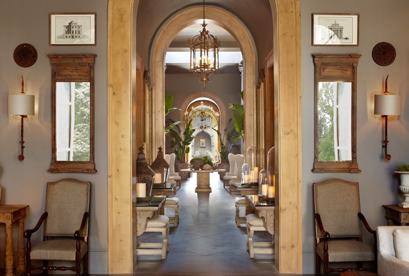 I confess, I love the new look Restoration Hardware (images above and below) has been promoting and the gray they use became an inspiration for upcoming (and much needed) upholstery fabric for the sofa, window seat cushion, and ladder back chair and ottoman.

Since the library was wallpapered about 8 years ago I thought it was a good time to take down the paper and paint (more on the renovation in a future post).
 Image via Elle Decor
I knew I didn’t want the paint to be too sunny since the room has so much natural light, sunglasses indoors isn’t a good look for me!
 Image via John Jacob Interiors
…I know this is a bathroom, but the color on the walls reminded me of Restoration Hardware paint and I really liked it. So I bought a smallish can of Restoration Hardware’s Graphite (it was similar in appearance to the above wall color.
 Image via Atmosphere blog
Additional inspiration…
 Image via Atmosphere blog
I have a gray-ish basket trunk from IKEA that I use for a coffee table so this image was additional ammo for the whole gray paint idea.
Many of you probably figure that finding paint is easy, right? Well, I have seen more paint chips over the past 2 ½ months than I care to mention and ultimately, I have decided to paint the room the same color the dining room is painted, “Inside Passage” by Dunn Edwards.
 Image via Country Living
I didn’t think white paint (as in the image above) would be a good fit for the “look” I ultimately wanted to achieve, however, I love this room by Kolene Spicher.
Meanwhile, I looked at Pottery Barn paint chips (Benjamin Moore paint), Restoration Hardware paint chips, Behr from Home Depot, Martha Stewart paint chips, also at Home Depot, and my head was aching by the end.
There are a lot of paint tools online and House Beautiful has one that works well, but there is nothing like painting a good sized patch on the actual wall and standing back to determine its merit. I ultimately called by good friend and designer, Gretchen, to weigh in on the sample. She saw green in the Restoration Hardware gray sample. Knowing her eye is better trained than mine I went back to the Inside Passage by Dunn Edwards.
 Image via Jackye Lanham – website
The wall color in the image above is what “Inside Passage” looks like. It has a bit of gray and taupe in it. I like it because it changes looks with various light.
Have you had to select wall color recently? Was it as challenging for you as it was for me?

Julie said:
Karen,
Many of the walls in my home have been painted with “Inside Passage”. After several years, I haven’t tired of the color and it seems to go with everything. I think you made a good choice!
Julie
Karen said:
Julie,
It was your home that inspired my first use of Inside Passage—seeing your lovely home the other night just sealed the deal for me and Inside Passage!
Thanks for the visit,
karen
Linda Coble said:
Karen,
I’ve always loved the Inside Passage color in your dining room so I’m sure it looks great in your sitting room. My last experiment with changing room color was the guest room. I finally settled on Salisbury Green after playing around with several others. Fortunately, it turned out great and I love it!
Karen said:
Choosing paint color is a bit of a gamble. Even when you paint a large sample you can only hope it looks as good as you imagined. I’m very happy with the results and will post about it soon.
Karen
Reviving Charm said:
I have to admit that selecting paint colors is my least part of decorating!
Karen B. said:
100% the way I feel too. I second guess my selection even after painting large swaths of paint on the wall!
xo,
Karen