Tags
Chapter 2 of “my dream home tour”…as you may have read HERE, I sometimes dream of the perfect home {is there such a thing?}. This comes more from my constant dreaming ♥ of homes, both large and small, than from any dissatisfaction with my own home. Like an avid artist or writer, I look for beauty in my surroundings. My own home continues to evolve over time (with mostly minor improvements) but there are days when I think, “wow, wouldn’t this be a cool fill in the blank with the room you are wishing for”
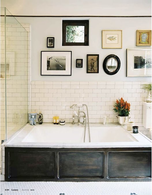
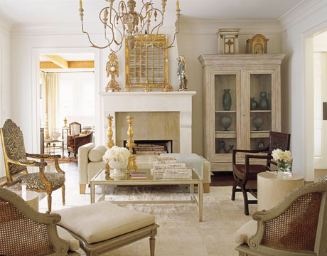
 Image via Brabourne Farm {Aimee Herring}
So as my tour continues, please come for dinner and enjoy my dream dining room(s)…
 {Malene Birger}
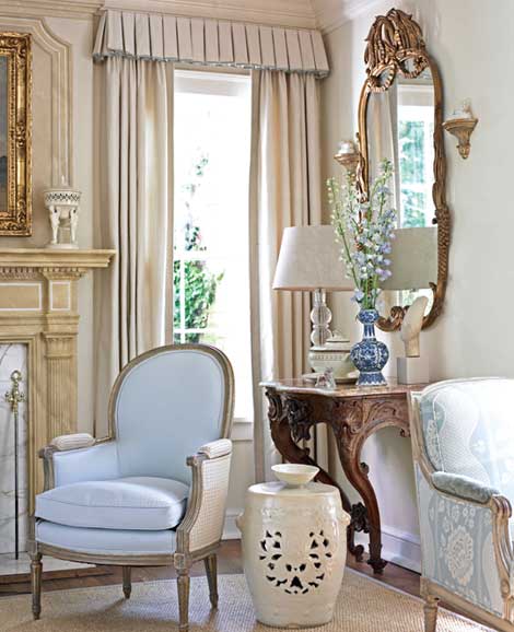
The simple lines of this table and the accessories on the top appeal to me.
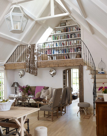
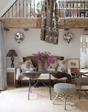
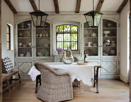
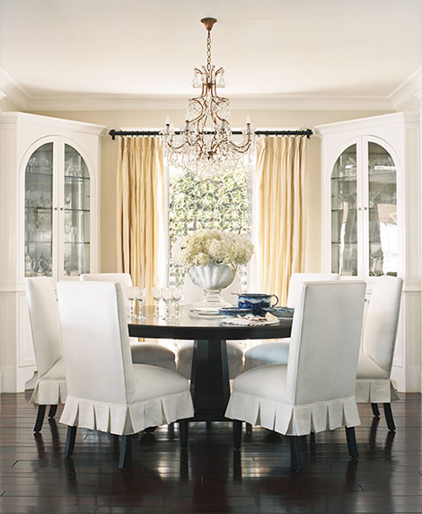
 Image by Tria Giovan – Veranda
The hardwood floors look great but I wonder how scratched they will get? Sliding the chairs, even with felt pads, sometimes causes problems. I do like an area rug, what do you think?
 If you love decorating and haven’t seen the movie “Somethings Gotta Give” you should see the movie for this dining room and all of the other rooms in the movie! Oh, and the story is a pretty good chick-flick.
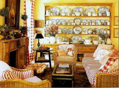
I just noticed there seems to be a lot of white in these dining room images. As you will see later, my dining room is NOT white. I do love the chippy white in this above image.
 Erin Paige Pitts
Visit HERE if you’d like to see the rest of Erin Paige Pitts lovely home. I love the contrast of the very dark wood floors against the white slipcovers on the dining room chairs, don’t you?
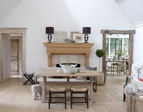
 Image via Cote de Texas
This is a favorite dining room…Kelly Harmon. (Yes, it’s the hunk, Mark Harmon of NCIS, sister). In fact, Kelly did the Tic Tac commercials for years. Turns out she is talented where her home design is concerned!
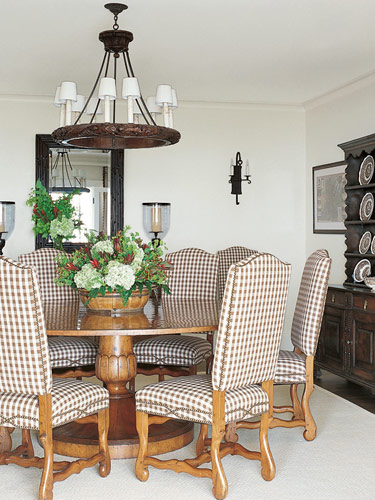 Image by Emily Followill
I’ve always liked the way a round table looks in a room but have wondered about its limitations. If you only entertain 1 other couple is it awkward? The chairs used here are beautiful and remind me of my friends Gretchen and Carol’s dining room chairs.
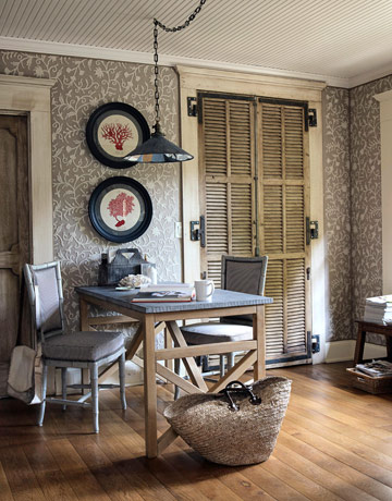
 Image via Slim Paley blog site
Another white dining room {sigh} This one holds my interest in part due to the blue flowers (a favorite) and it would appear there are blue goblets on the table as well. Very pretty.
 Image via The Lettered Cottage
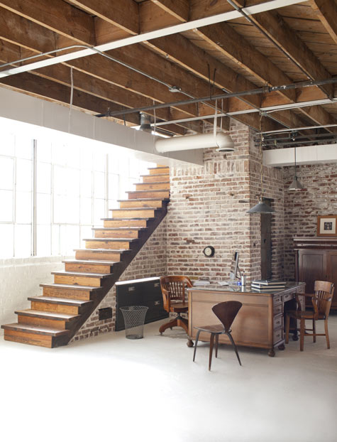
I realize this picture doesn’t show you very much of Layla Palmer’s dining room but after she and her husband Kevin created this wall by ripping down dry wall I thought the effect was so great I wanted to share it with you.
 Image by Victoria Pearson ~ Will Smith
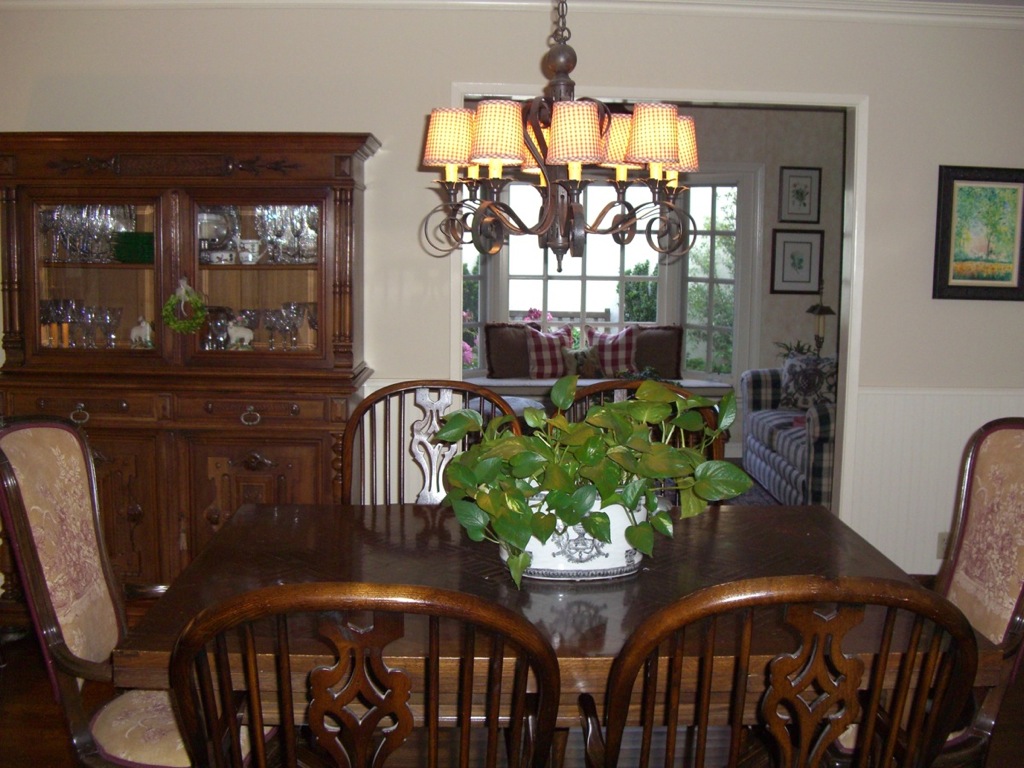
I have a black and white cat and my chairs are very similar…mine are splat back Windsor chairs…no fireplace, darn! 🙂
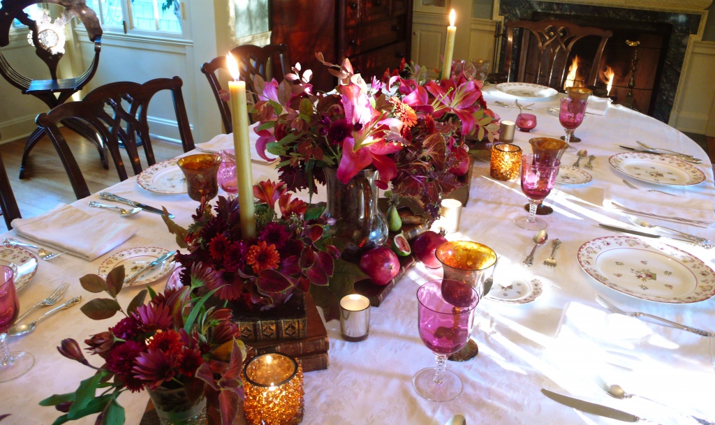
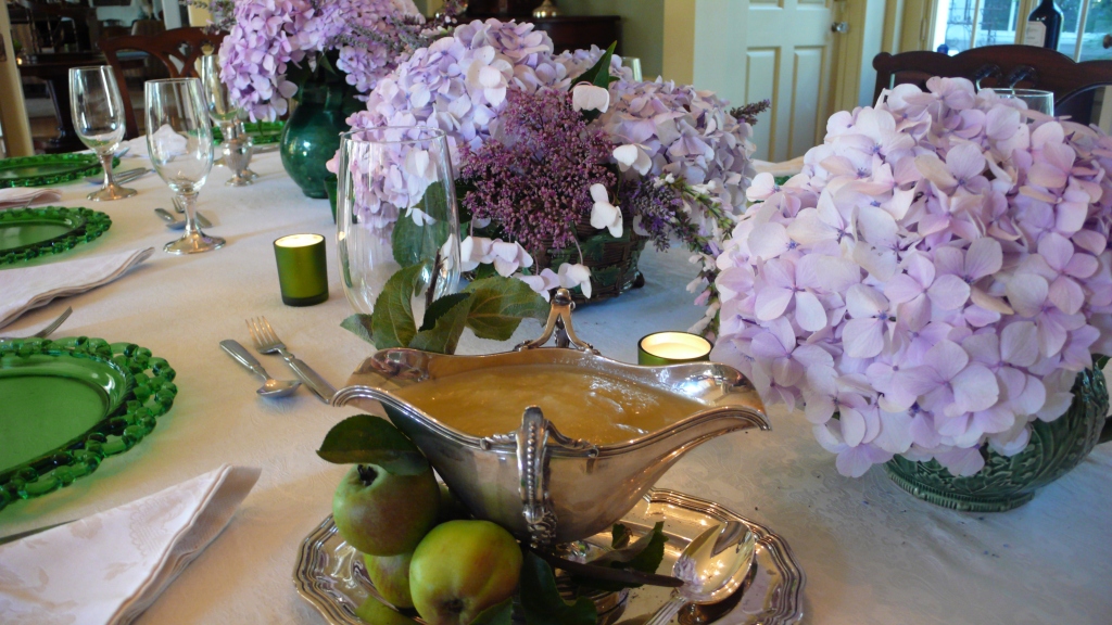
Here is my dining room. My only complaint, other than the whole not having a fireplace whine, is that it is the darkest room in my house. I guess it’s good that we mostly entertain in there during evening hours. 🙂
 GHP Dining Room
 GHP Dining Room
 Dining Room side board
 Dining Room with sisal rug
So, shall we eat? I’m hungry. Thank you for joining us for dinner.